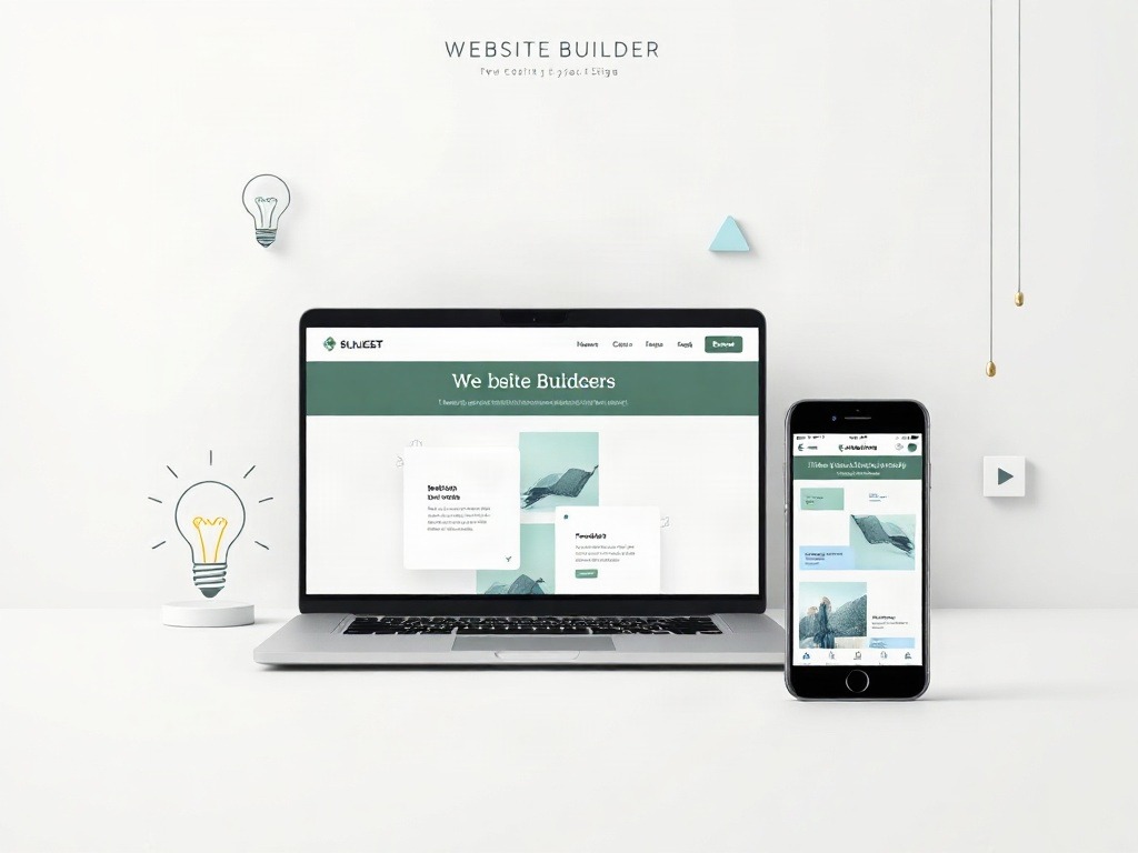
Six weeks ago, I had zero web presence beyond a dusty LinkedIn profile and a Gmail account. No portfolio. No side project showcase. Nothing. The prospect of building a website felt like one of those things I'd "get around to eventually"—you know, like learning Spanish or finally organizing my photos.
Then a freelance opportunity came up that required a portfolio link. Suddenly, "eventually" became "this week."
What surprised me most? Building a completely functional, respectable-looking website took about four hours total. Not days. Not weeks. Four hours. And it cost me exactly zero rupees. No hidden fees, no premium upsells I felt obligated to buy, nothing.
I want to walk you through what actually worked for me—not the theoretical "you could do this" approach, but the specific choices I made, why I made them, and where I'd do things differently next time.
Start by Choosing Your Builder (This Matters More Than You Think)
There are roughly seven million website builders out there, and most of them prey on your indecision. They throw around words like "powerful," "intuitive," and "professional" until you feel dumb for not immediately knowing which one is right for you.
I tested three seriously. Not casually scrolled through their homepages—actually signed up and built a test site on each.
Wix vs. Squarespace vs. WordPress.com
Wix felt like it was designed for people who panic when confronted with choices. Everything is drag-and-drop, templates are flashy, and you can break things by dragging elements into weird places (which I did repeatedly). Free tier has a Wix watermark and limited features. The editor is snappy, though—genuinely responsive, no lag. Best for: people who want instant gratification.
Squarespace is the prettier cousin. Templates look magazine-quality out of the box. But here's what bothered me—customization felt restrictive. You're beautiful, but within bounds. Want to move that button two pixels left? Good luck. Free trial only, no permanent free tier. Best for: creatives who don't mind constraints if the result looks stunning.
WordPress.com gave me more flexibility than Wix but required slightly more patience. The free tier is genuinely usable—no watermark, you own your content, but you get a wordpress.com subdomain (not ideal, I know). However, upgrading to a custom domain is cheap (about ₹1,500–2,000 annually). Best for: people planning to stick with this long-term.
I went with WordPress.com free tier. Why? Because I'm not planning to abandon this in three months, and the thought of a watermark annoyed me more than learning slightly more buttons.
The Actual Setup Process
WordPress.com's signup took three minutes. Email, password, site name (I named mine based on my initials and field—boring but functional), and I was in.
The dashboard is overwhelming at first glance. Menus everywhere. Settings nested in settings. But you don't need 90% of it initially. Ignore all that. Go straight to "Themes."
Pick a Theme That Doesn't Make You Cringe
A theme is basically a template—the skeleton of your site. It determines layout, fonts, colors, how pages are organized. Choosing poorly here means spending hours fighting default settings. Choosing well means you're 70% done before you even start writing.
WordPress.com has about 200 free themes. Most are either dated, unnecessarily complicated, or aggressively generic. I sorted by "portfolio" and "blog" categories, which narrowed it down to maybe thirty reasonable options.
My Selection Criteria
I wanted something minimal. Not trendy-minimal (which looks dated in two months), but actually minimal—white space, readable fonts, not trying too hard to impress.
I tested about six. Sounds excessive, but I could test each one in literally two minutes by clicking "preview" and scrolling through how it would display different content types.
Ended up choosing "Neve." It's not exciting. No animated backgrounds or parallax scrolling nonsense. It's clean, loads fast (I could feel the speed difference even on my laggy home WiFi), and every element is where you'd expect it to be.
Here's what sold me: the customization panel let me change colors and fonts without touching code. That matters if you have brand colors (I don't, but I appreciated the option). And the preview updated in real-time—you change a color, you immediately see it on the site preview. No "click save and wait."
Add Your Actual Content (This Is Where Most People Quit)
Once you pick a theme, you've got pages. A homepage. An about page. A blog. A contact form. The template's doing the heavy lifting visually.
Now you have to fill it with actual words about yourself. This is where it gets real.
Homepage—Keep It Stupid Simple
Your homepage is not your autobiography. It's a handshake. It should answer three questions in under ten seconds:
Who are you? What do you do? Why should I care?
I did a single paragraph with a photo. Name. One sentence about what I do. A link to my work. Done. Took twenty minutes including finding a decent photo that wasn't a corporate headshot (I used Unsplash, which is free and surprisingly good).
I used to think homepages needed to be elaborate. Turns out people just want to know if they're in the right place. Get them to the relevant section fast.
About Page—The Only Place You Can Be Slightly Verbose
This is where personality lives. Your homepage is doors. Your about page is the actual conversation.
I wrote about three paragraphs. Where I'm from, what I do, why I do it, what I'm interested in learning. Didn't overthink it. Used the same casual tone I'm using here—conversational, not corporate-brochure-speak.
Added a small professional photo and a few relevant links (Twitter, LinkedIn, email contact). That's it.
Portfolio or Blog Section—Show, Don't Tell
This matters more than the about page. If you say you're good at something, prove it. Link to actual work. Write actual case studies or blog posts.
I had three completed projects to showcase. WordPress let me create a "portfolio" page and add individual project posts. Each one had: what the project was, what the challenge was, what I did, and a link to the final result or more details.
Didn't need to be elaborate. A few paragraphs, some images, honest context. People care about whether you can actually do the thing, not whether you can write marketing copy about doing the thing.
| Page Type | Time to Complete | Critical Info |
|---|---|---|
| Homepage | 15-20 minutes | Photo + one paragraph. Nothing fancy required. |
| About | 30-45 minutes | 3-4 paragraphs, genuine voice, one photo. |
| Portfolio/Projects | 1-2 hours (if you have 3-5 projects) | Actual work + brief context per project. |
| Contact | 5 minutes | WordPress handles this automatically. Just activate it. |
The Annoying But Necessary Final Touches
Website looks respectable. But there are some finishing details that separate "I built this in an afternoon" from "this actually looks professional."
Domain Name (Optional But Worth It)
Your WordPress.com free site comes with a URL like yourname.wordpress.com. It works. It's functional. But it screams "I got the free version."
A custom domain costs about ₹200-300 per year in India. Not expensive. WordPress.com lets you register directly through their platform, which is painless—they handle all the backend DNS stuff.
I bought mine (firstname.com format, available because my name is common but not that common). Took two minutes, charged to my credit card, was active instantly.
Is it necessary? No. Does it make the site feel more legitimate? Absolutely. For the cost of two cups of coffee annually, I think it's worth it.
Customization—But Not Too Much
WordPress.com's customizer lets you change colors, fonts, layouts without coding. I adjusted the header color to match a blue I like, changed the default font to something less generic, and called it done.
I could spend days tweaking. Adjusting padding here, opacity there, exploring every setting. I resisted that urge. Good websites look finished, not obsessed-over. Spent about twenty minutes, then forced myself to stop.
SEO Basics (This Actually Matters)
I used WordPress's built-in SEO tools. Nothing fancy—just filled in meta descriptions for each page (the 160-character summary that shows up in Google search results) and made sure my main keywords appeared naturally in page titles and first paragraphs.
Jetpack (WordPress's plugin suite) has a free SEO checklist. Genuinely useful. It flags things like "page is too short" or "keyword density is off." Not the enemy—practical feedback.
My Take
I went in expecting this to be harder. The actual barrier to entry felt almost embarrassingly low—which was both good and unsettling. Good because I had a professional-looking site in an afternoon. Unsettling because it means anyone can do this, which devalues the effort slightly in my head (irrational, I know).
What genuinely surprised me: the biggest time sink wasn't technical. It was writing about myself. Deciding what to include, how to phrase accomplishments without sounding self-important, choosing photos that didn't look corporate but also didn't look sloppy. The builder itself? Infrastructure. Almost invisible once you pick a decent theme.
The free tier actually works. I thought I'd hit limitations within weeks and cave to a paid plan. Six weeks in, I haven't felt that pressure. WordPress.com's free tier is genuinely free—not a hobbled version designed to frustrate you into paying.
Who's this actually for? Students building portfolios, freelancers needing a credibility anchor, professionals pivoting careers who need something online fast, people with side projects they want to showcase. Anyone except maybe large businesses with complex requirements.
Verdict
Build your site. Today if possible. The cost is zero, the time commitment is genuinely four hours, and the credibility boost is real. I've had two inquiries from people who found my site through Google, both of which led to work. That's the unexpected return I wasn't expecting.
WordPress.com free tier is my recommendation for most people. Wix if you want a flashier look and don't mind the watermark. Squarespace if you're willing to pay (₹1,200+ monthly) for premium templates and don't need a permanent free option.
The best builder is the one you'll actually finish. Pick one, block two hours this weekend, and launch. Perfectionism is the only thing stopping you.
Published by Dattatray Dagale • 05 November 2026







0 Comments